Dataset
The dataset tracks flight prices along with variables like days left before departure, departure time, and flight duration.
The goal is to see which factors seem to influence price the most.
Dataset shown below as a screenshot, note: screenshot only shows 20/300,000 datapoints.
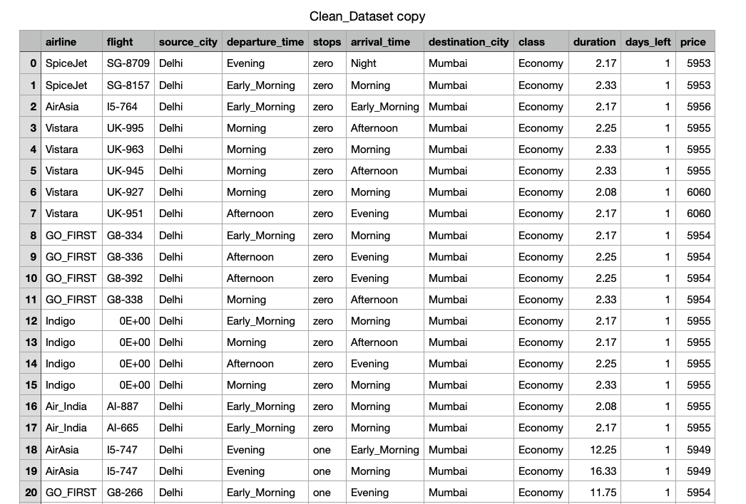
Chart 1: Days Left vs. Price
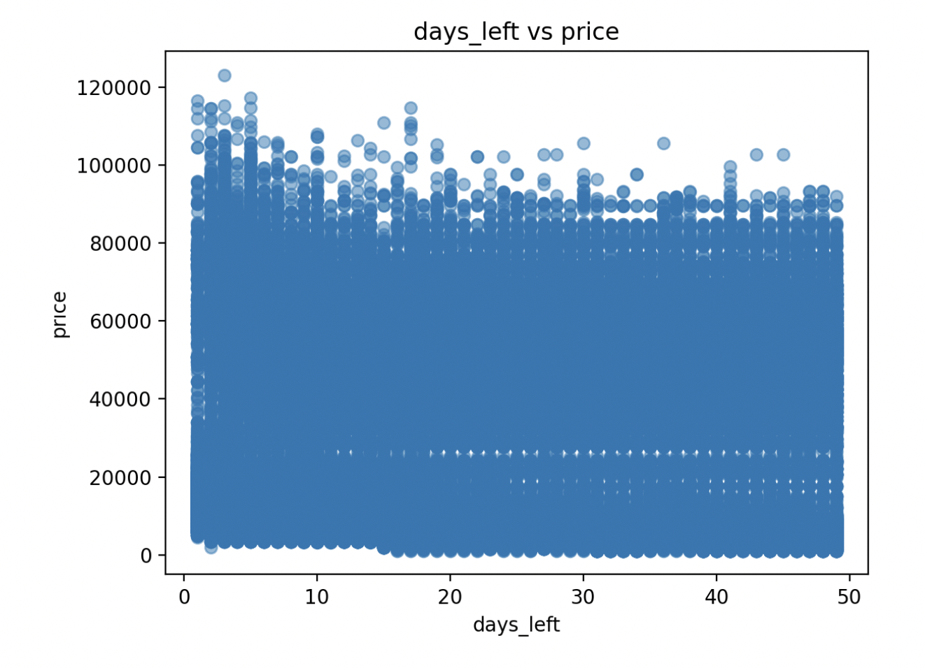
This scatter plot shows that flights booked closer to the departure date cost more.
The points form a downward trend, meaning prices drop the earlier you buy.
It’s a simple but clear way to visualize how timing impacts cost.
Chart 2: Average Price by Departure Time
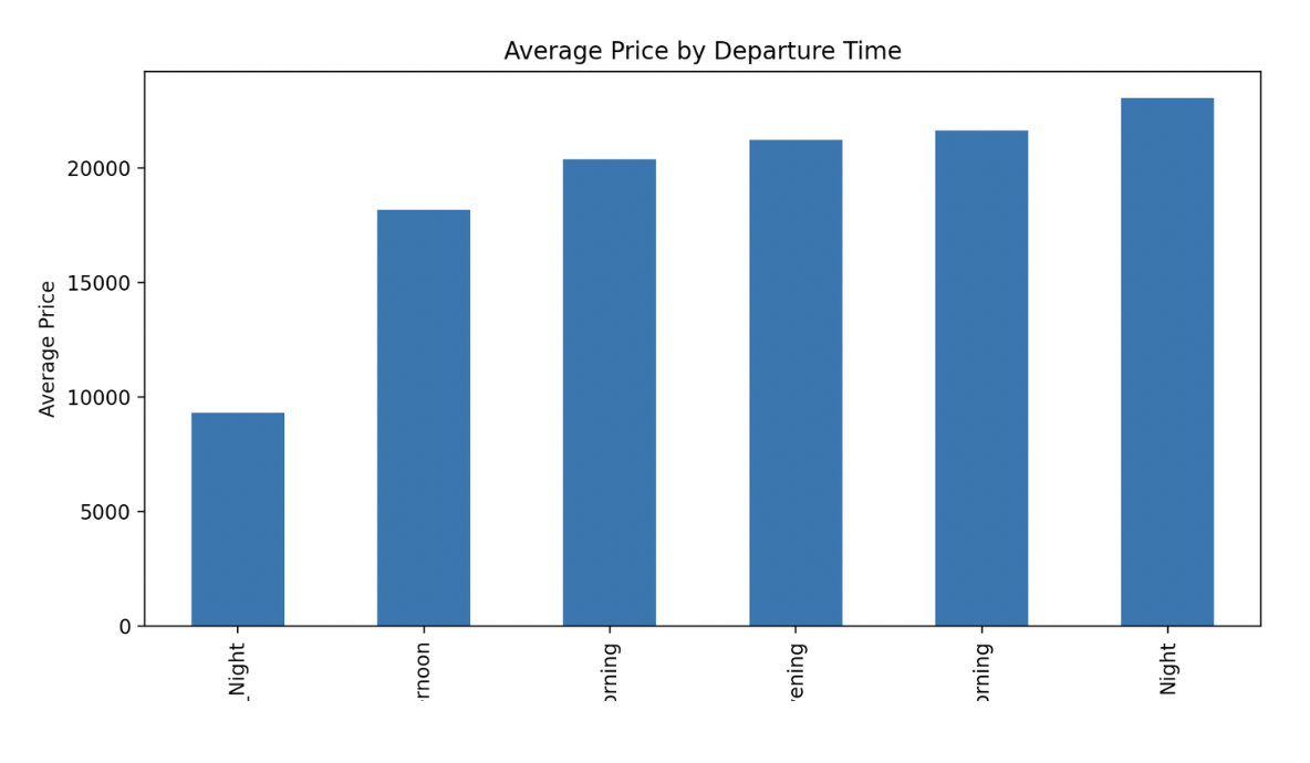
This bar chart compares average prices for flights at different times of day.
Morning and mid-day flights are usually cheaper, while evening and night flights cost more.
The chart makes it easy to see how convenience affects what people pay.
Chart 3: Correlation Between Variables
This chart shows correlations between the main variables in the dataset.
Days left and price have a strong negative correlation, while duration has a weak positive one.
It helps show which factors actually matter most in predicting prices.